
The digital humanities and data analysis landscape, often dominated by the latest advancements in large language models and generative AI, is witnessing a compelling resurgence of a foundational visualization tool. ImagePlot 2, an updated iteration of a tool originally developed by Lev Manovich and his team, offers a powerful, locally-run, and free method for transforming vast collections of images into insightful visual representations. This revival underscores the enduring value of statistical techniques in understanding complex visual data, a stark contrast to the often opaque and computationally intensive processes of modern AI.
A Return to Foundational Data Visualization
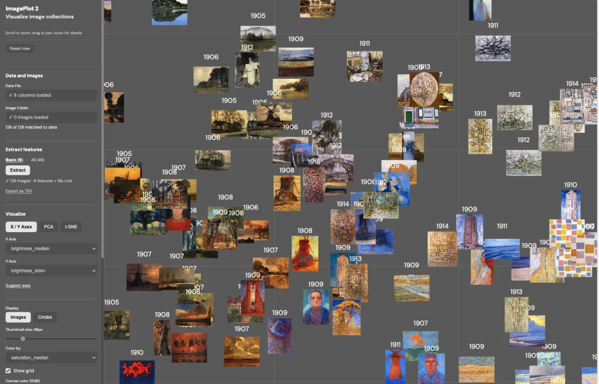
ImagePlot 2 represents a significant update to a concept that first gained traction around 2011. The tool’s core functionality lies in its ability to process a folder of images and generate a visualization, effectively creating a "big cloud of dots" where each dot represents an image. This method, rooted in statistical analysis, allows users to explore image collections based on inherent visual characteristics, such as color palettes or temporal ordering, without relying on complex semantic interpretation often associated with AI. The local execution of ImagePlot 2 is a key feature, ensuring data privacy and accessibility, as it runs entirely within a user’s web browser without the need for external servers or cloud processing.
The satisfaction derived from this approach, as noted by early adopters, stems from its directness and tangibility. Unlike the often abstract outputs of generative AI, ImagePlot 2 provides a concrete, visual summary of an image dataset. This allows for intuitive exploration and discovery, particularly for individuals with extensive "Folders Of Random Stuff" – a common phenomenon in the digital age. The developers also hint at the potential for expanding this methodology to other data types, noting the existence of similar audio analysis tools and expressing curiosity about building further applications.
Understanding the Engine: PCA and t-SNE
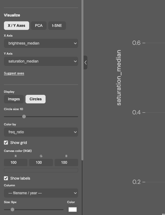
At the heart of ImagePlot 2’s analytical power lie two key statistical techniques: Principal Component Analysis (PCA) and t-distributed Stochastic Neighbor Embedding (t-SNE).
-
Principal Component Analysis (PCA): PCA is a dimensionality reduction technique used to simplify complex datasets by identifying the principal components – the directions of greatest variance in the data. In the context of image analysis, PCA can distill the essential visual characteristics of images, bringing salient features to the forefront and making them more amenable to analysis. For those without a deep statistical background, PCA can be understood as a method that highlights the most significant patterns within a dataset, allowing for a clearer view of underlying structures.

-
t-distributed Stochastic Neighbor Embedding (t-SNE): t-SNE is a non-linear dimensionality reduction technique primarily used for visualizing high-dimensional data. It maps complex datasets with many dimensions into a lower-dimensional space (typically two or three dimensions), where points that are close together in the original high-dimensional space are also close together in the lower-dimensional representation. This makes it easier for human perception to navigate and understand the relationships within vast datasets. In essence, t-SNE aims to preserve the local structure of the data, revealing clusters and patterns that might otherwise be obscured.
The availability of these powerful analytical tools within a free, locally-run application democratizes advanced data visualization, making it accessible to researchers, artists, students, and enthusiasts alike.
Accessibility and Usage
Getting started with ImagePlot 2 is straightforward. Users can download the project and run it locally. While the interface may initially display a warning about "uploading" files, it is crucial to note that all processing occurs client-side, ensuring the security and privacy of the user’s data. Users have the option to drop any folder of images directly into the application or to utilize sample image sets and data files provided via a Google Drive link for a quick demonstration of its capabilities.
The accompanying visual examples, such as the generated "cloud of dots" representing image collections, illustrate the potential for uncovering hidden relationships and structures within visual archives. These visualizations can reveal thematic groupings, stylistic similarities, or temporal trends that might not be apparent through manual inspection.
The Resurgence of Cultural Analytics
The re-emergence of tools like ImagePlot 2 coincides with a growing interest in "cultural analytics," a field pioneered by Dr. Lev Manovich in 2005. Cultural analytics seeks to apply computational methods, including data visualization, machine learning, and statistics, to the study of culture and media. This approach offers a critical and analytical framework, moving beyond simplistic or purely descriptive applications of technology.
The Cultural Analytics Labs, associated with institutions like the California Institute for Telecommunication and Information (Calit2) and the CUNY Graduate Center, exemplify this interdisciplinary approach. These labs combine methodologies from humanities, social sciences, and media studies with advanced computational techniques. Their work aims to provide a more nuanced understanding of cultural phenomena by leveraging data-driven insights alongside traditional scholarly inquiry. This stands in contrast to what is sometimes perceived as "black-box technosolutionism," where advanced technologies are applied without critical examination or deep understanding of their underlying principles.
The emphasis on local processing and transparent statistical methods offered by ImagePlot 2 aligns well with the core tenets of cultural analytics. It empowers researchers to explore their data directly, fostering a deeper engagement with the analytical process and encouraging critical interpretation of the resulting visualizations.
Broader Implications and Future Directions
The implications of ImagePlot 2 extend beyond academic research. For artists, designers, and curators, it provides a novel way to organize, analyze, and present large visual archives. Imagine a photographer using it to analyze the thematic evolution of their work over years, or a museum using it to visualize the stylistic commonalities across a vast collection of digitized artworks.
The tool’s ability to sort images by date or color, as mentioned by users, offers a more concrete and interpretable form of organization compared to the sometimes unpredictable results of AI-driven tagging or content-based image retrieval. This direct manipulation of visual data can lead to serendipitous discoveries and new insights.
The project’s developers are also keen on exploring further applications. The successful adaptation of these visualization techniques for images naturally raises questions about their potential for other media formats, such as audio. The "Folders Of Random Stuff" scenario highlights a common challenge in managing and understanding personal digital archives, suggesting that tools like ImagePlot 2 could have a significant impact on how individuals interact with their own digital legacies.
Furthermore, the integration of machine learning techniques, as seen in the broader field of cultural analytics, suggests a future where tools like ImagePlot 2 could be combined with more sophisticated AI models. This could lead to hybrid approaches that leverage the strengths of both statistical visualization and advanced pattern recognition, offering even richer insights into complex datasets. The "Phototrails: Visualizing 2.3 M Instagram photos from 13 global cities" project, which likely employed similar foundational visualization principles to analyze a massive dataset of social media imagery, serves as a powerful example of the scale and scope of what can be achieved. Such projects demonstrate the profound capacity of these techniques to reveal patterns in global visual culture, from urban aesthetics to social trends.
In conclusion, ImagePlot 2 is more than just a software update; it represents a reaffirmation of the power of accessible, transparent, and statistically grounded data visualization. In an era increasingly defined by complex and often inscrutable AI, this tool offers a refreshing and empowering alternative for understanding the visual world around us. Its continued development and application are likely to play a significant role in the evolving fields of digital humanities, cultural analytics, and beyond.


